CommerceFlo
One product, four ways to look for it, twenty eight pages to build.
- Role
- Product design, marketing site
- Where
- FactoryJet Pvt Ltd · freelance, in a team of three
- Year
- 2025
- Platform
- Responsive web, WordPress
- Tools
- Figma, Design Systems, Helvetica Now Display, WordPress
- 28Pages in the catalogue
- 12Weeks, with three of us
- 4Parallel taxonomies in the nav
- 13Section components on the home page
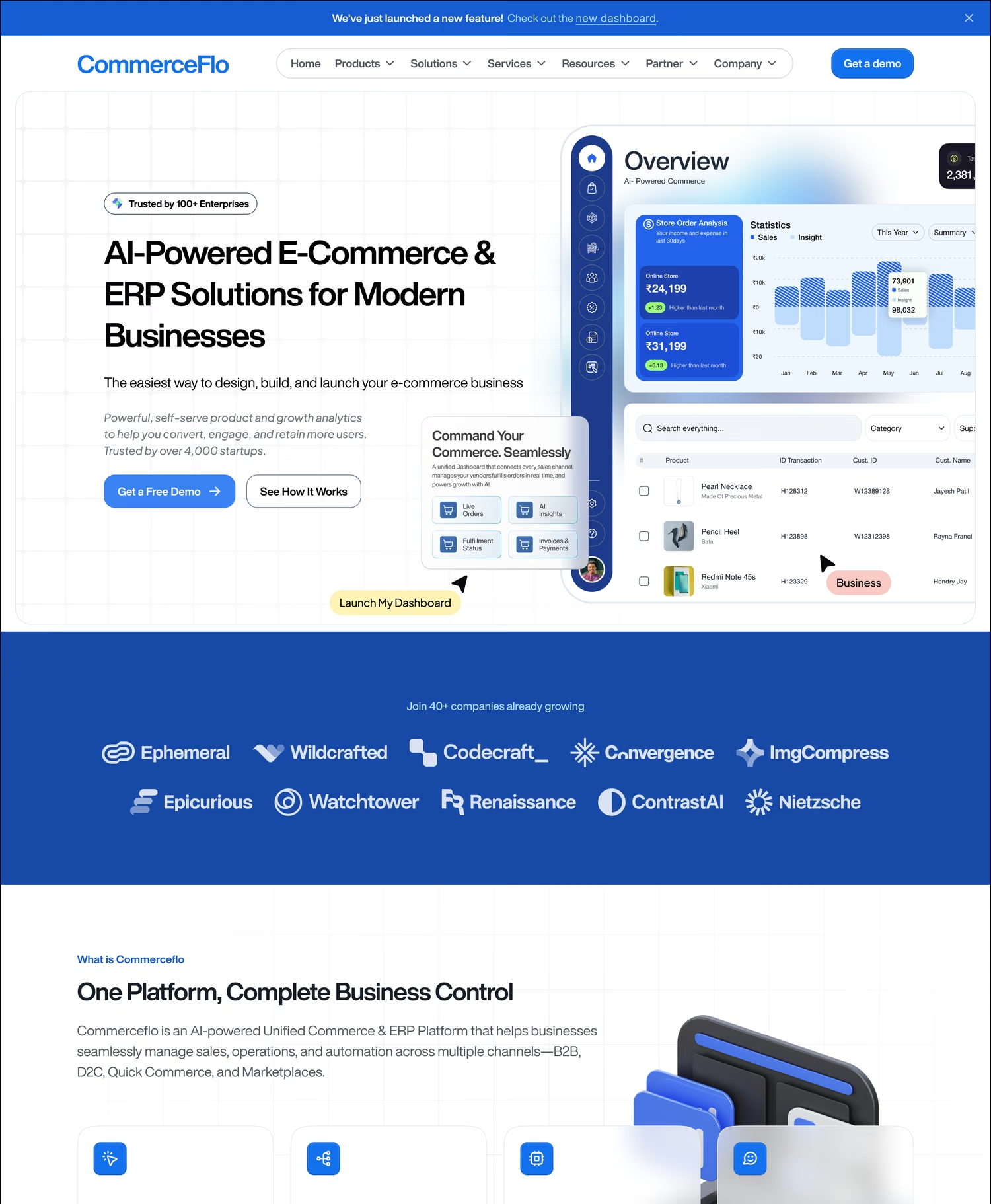
One product, four ways to look for it
CommerceFlo was FactoryJet's commerce and ERP platform: online store, marketplace sync, B2B ordering, retail POS, distributor management, accounting, all sold as one system. I did not design the platform. I designed the site that had to sell it, which is a different job with a different hard part.
The hard part is the catalogue. A buyer arriving at a platform this wide does not know what to call the thing they need. The founder of a shoe label looks for Fashion. Someone doing the same job with a different vocabulary looks for D2C. A distributor looks for Wholesale and the procurement lead at that same distributor looks for B2B. Miss their word and you lose them, so the navigation carries four parallel cuts of one product: Platform, By Business Model, By Industry, By Use Case, with Automation, Integrations, Services and Resources beside them.
Every entry in every cut needs a page of its own, and every menu row carries a name plus roughly five capabilities under it. That is twenty eight destinations, in twelve weeks, with three of us, handed to a client who would be editing all of it in WordPress after we left.
- Four parallel taxonomies
- 28 destinations
- Client edits it in WordPress
- Twelve weeks, three people
- Copy written alongside design
Browse the set
28 designsThe chips are the cuts the site was built around, so filtering this set is the same act as understanding the problem. Open any page and scroll it at full length; the routes are the ones each design shipped at. Twenty six of the twenty eight catalogue pages are here. The two missing are Developer Tools and Marketplace Management. Core pages holds the blog index and the article template, which had to survive being filled by whoever was free that week.
One page, built to be filled twenty six times
Twenty eight bespoke pages was never going to happen in twelve weeks with three people, and twenty eight pages of the same three sections would have read as filler. What the catalogue actually needs is one skeleton with enough slots that each audience sees their own language in it, and enough discipline that a reader who lands on two of them does not feel duplicated.
So the page is a fixed sequence: hero with the audience's own promise in it, the client strip, a single blue statement band, a capability grid built from real interface, proof from that sector, then the closing band and the footer. Every slot has a defined job, which is what makes it safe to hand to someone else to fill.
The homepage is the same idea one level up. It is thirteen section components stacked, not a drawn page, so a section could be reordered or dropped without redrawing anything around it.
What the template does not make cheaper is the pictures. Every page needed its own set: product imagery chosen or made for that sector, interface captured and composed into the capability cards, each one specced and checked. That, not layout, is where a twelve week schedule actually goes, and it is the part that gets left out when people talk about shipping twenty eight pages.
- Fixed section order
- Hero speaks the sector's language
- Capability grid from real UI
- Reorderable sections
- Imagery made per page
Four sectors, one hero

Atomic, because someone else has to maintain it
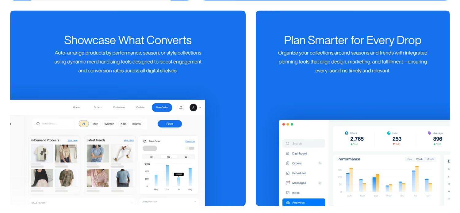
The component library is not a flourish here, it is the delivery mechanism. A client editing pages in WordPress after handover cannot be asked to rebuild a layout, so the pieces they touch had to be small, named and repeatable: navigation, badge, button, feature card, statement band, capability card with a screenshot slot, testimonial, footer.
The capability cards carry real interface rather than icons. On a platform this abstract, a picture of the actual screen is the only thing that separates a claim from a promise, and it is the part a buyer scrolls back to.
- Named, reusable sections
- Real UI inside the cards
- Built for CMS handover
What a capability card actually holds
The system underneath
- Brand 600Primary#1570EF
- Brand 700Hover, links#175CD3
- Brand 800Section fill#1849A9
- Brand 200On brand text#B2DDFF
- Text 900Headings#181D27
- Text 600Body#535862
- BorderHairlines#D5D7DA
- WhiteGround#FFFFFF
Type: Helvetica Now Display, display and body, Display 24 / 30 / 36 / 48 / 60 / 72, Text 12 / 14 / 16 / 18 / 20, 1280 container, 32 gutter
Both sites, to scale
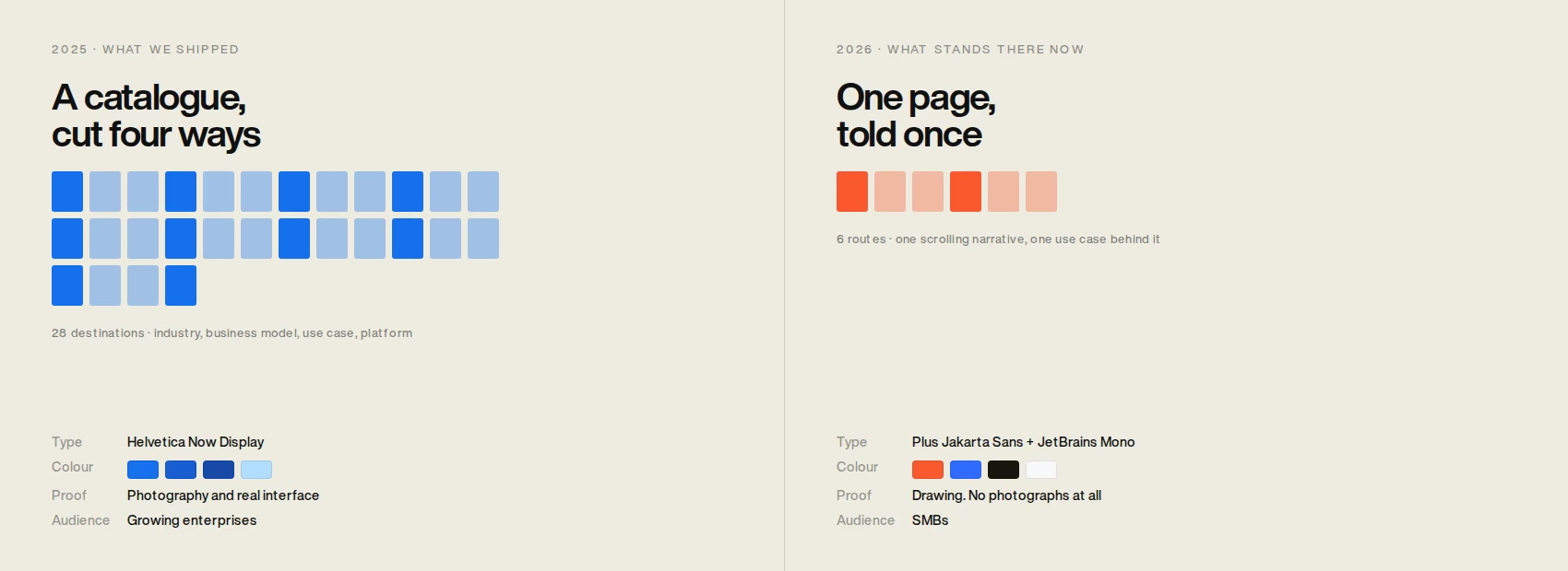
The same domain, a year later
Two briefs, a year apart. Measured off the live page, August 2026Navigation
BeforeFour parallel taxonomies and twenty eight destinations, because an enterprise buyer arrives with their own word for the problem and you cannot afford to miss it.
AfterOne scrolling page and six links: How it works, The agents, Use cases, Platform, Pricing. Behind Use cases there is a single page, for D2C and CPG brands.
Who it is for
BeforePurpose-built for growing enterprises that need control and speed, with Trusted by 100+ Enterprises above the fold.
AfterBuilt so an SMB can run DTC, B2B, marketplaces, and retail without hiring a specialist for each one.
Typeface
BeforeHelvetica Now Display doing display and body. A neutral grotesk, chosen to stay out of the way of a catalogue that changes voice on every page.
AfterPlus Jakarta Sans, with JetBrains Mono on eyebrows and interface labels. The current signature of an AI product.
Colour
BeforeA blue ramp from #1570EF to #1849A9 on white, with solid blue bands carrying the statements. Enterprise software colour, deliberately.
AfterWarm off-white, ink at #1A140F, and a single orange #FA582D carrying every call to action.
What proves the claim
BeforePhotography and real interface. Every capability card on every page carries a screenshot of the actual product.
AfterDrawing. The page holds no photographs at all: zero image elements, twenty two inline SVGs, one illustrated command centre.
Social proof
BeforeJoin 40+ companies already growing, over a strip of client logos.
AfterWe're new. The math isn't.
What happened to it
It shipped and it ran. The earliest public capture is 5 November 2025 and the last is 9 March 2026, with all twenty eight pages up and the client publishing to the blog. The copy drifted after handover, as marketing copy does: the hero I designed against read AI-Powered E-Commerce & ERP Solutions for Modern Businesses, and by March the live page led with Unify Sales with One Seamless Platform.
This was the right answer to the brief in front of us. In 2025 CommerceFlo was sold to enterprises, buyers arrived through search carrying their own word for the problem, and the client needed a site they could keep extending in WordPress after we handed it over. A catalogue cut four ways is what that brief costs, and a template with a component set under it is the only way three people build twenty eight of them in twelve weeks. Given the same brief tomorrow I would build it the same way.
Then the site was replaced. The domain still resolves and everything above is gone from it. I am not going to claim I know who rebuilt it or why, because from outside I cannot tell a sale from a relaunch, and the page itself now says We're new.
What I will say is that the two sites are answers to two different briefs, and the second brief is not the one I was given. Twenty eight pages is the correct answer to an enterprise catalogue where a distributor and a procurement lead at the same company search with different words. It is the wrong answer for an SMB pitch, where one story told once beats a taxonomy nobody browses. The audience moved, so the architecture moved with it. That is a positioning decision, not a verdict on either design.
The honest ledger, both ways. What went with the old site was the industry vocabulary: twenty six pages each addressed in their audience's own language, and a capability grid built on real interface rather than illustration, which is still the thing I would fight for on a platform this abstract. What the new one does that ours did not is ship without placeholders. We launched with a strip of sample client logos and an article template holding filler, because the site was ready before the content was.
Twenty eight pages, four taxonomies, twelve weeks, three people. That ratio is the whole argument for building a template and a component set before drawing a single finished page, and it is the part of this project I would do the same way again.
There are no outcome numbers on this page. Nothing was instrumented, no baseline was taken, and the site it would have measured no longer exists. Every figure at the top is a count of something you can still see: pages, taxonomies, sections, weeks.